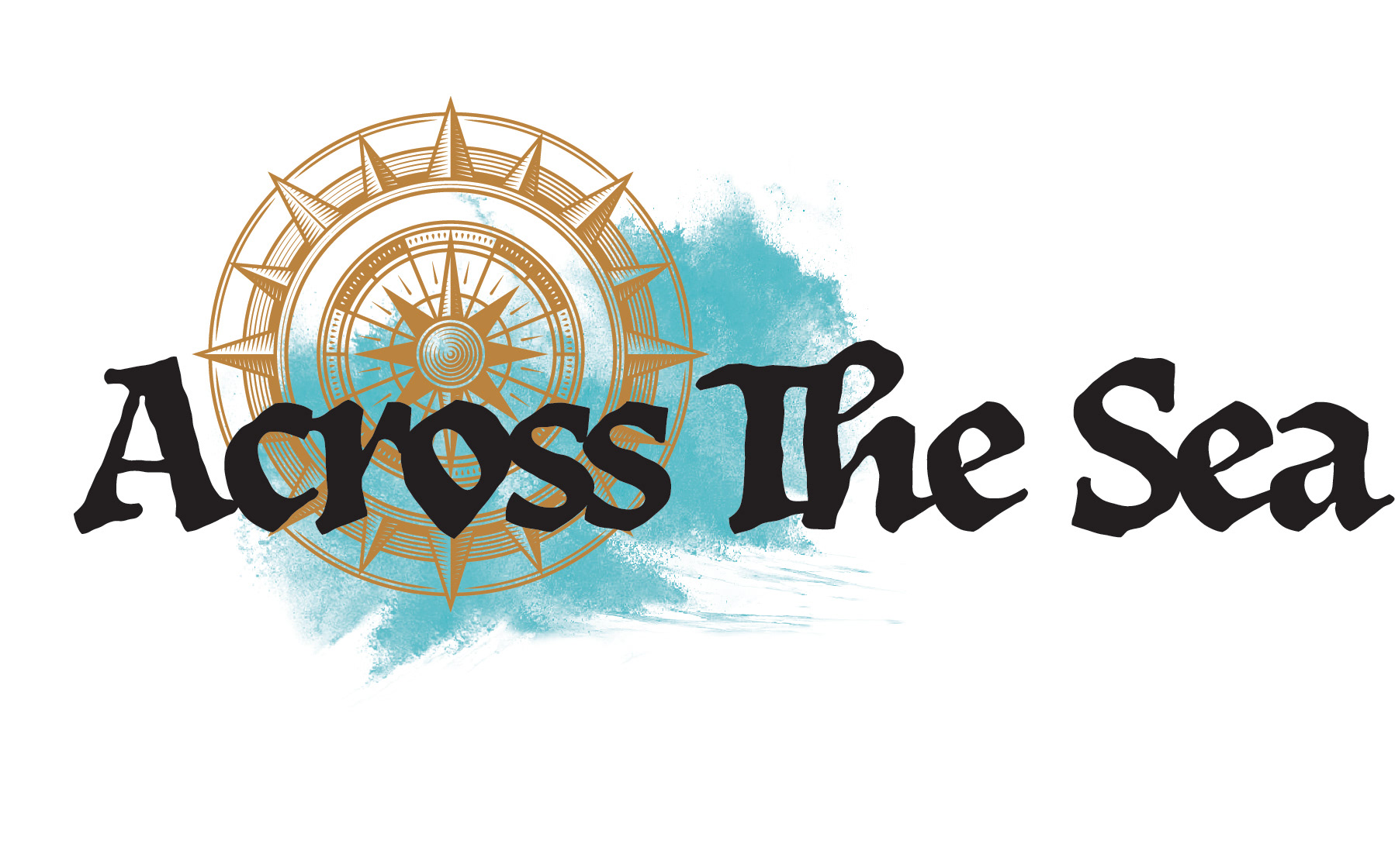
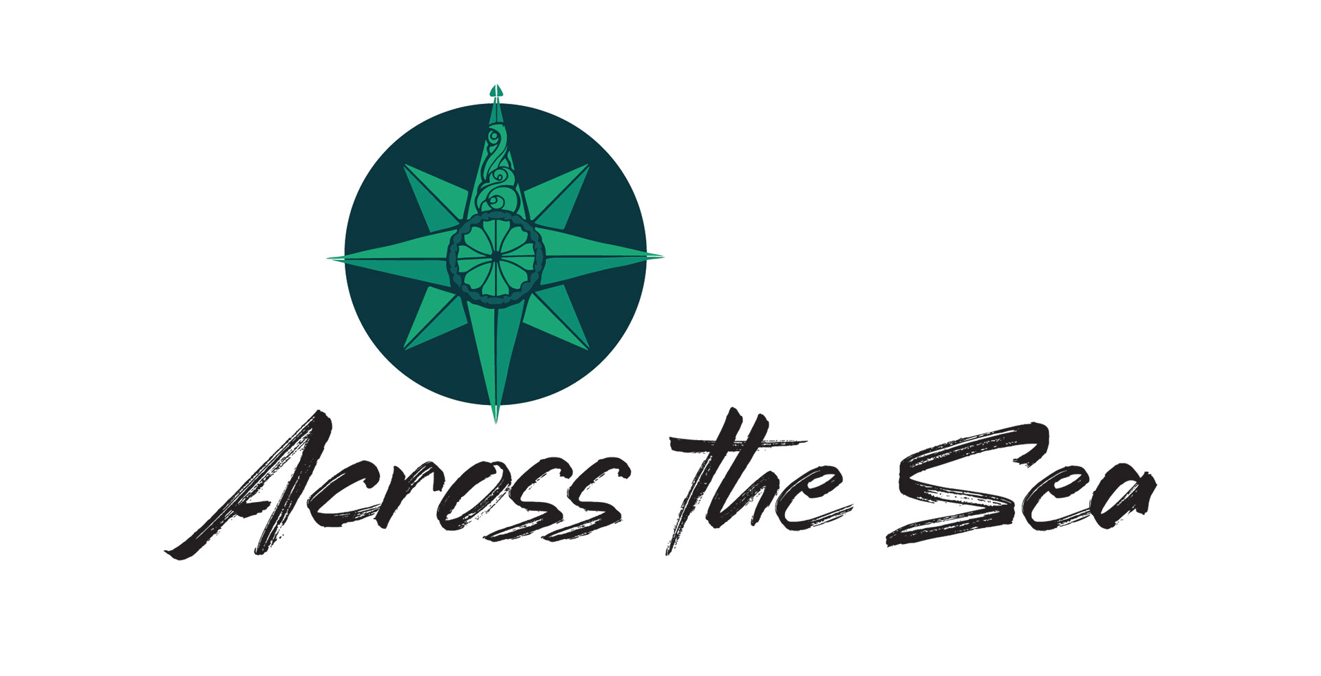
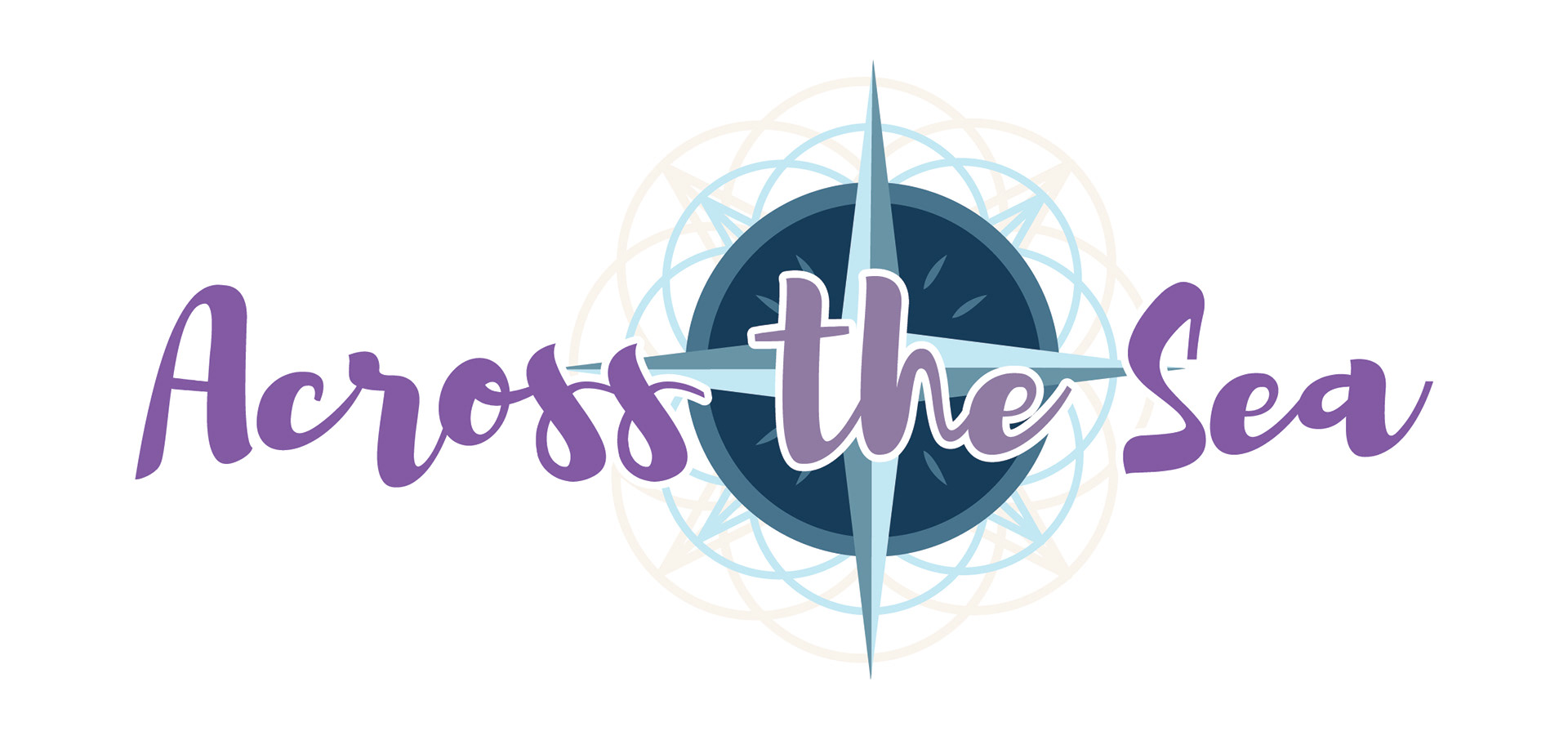
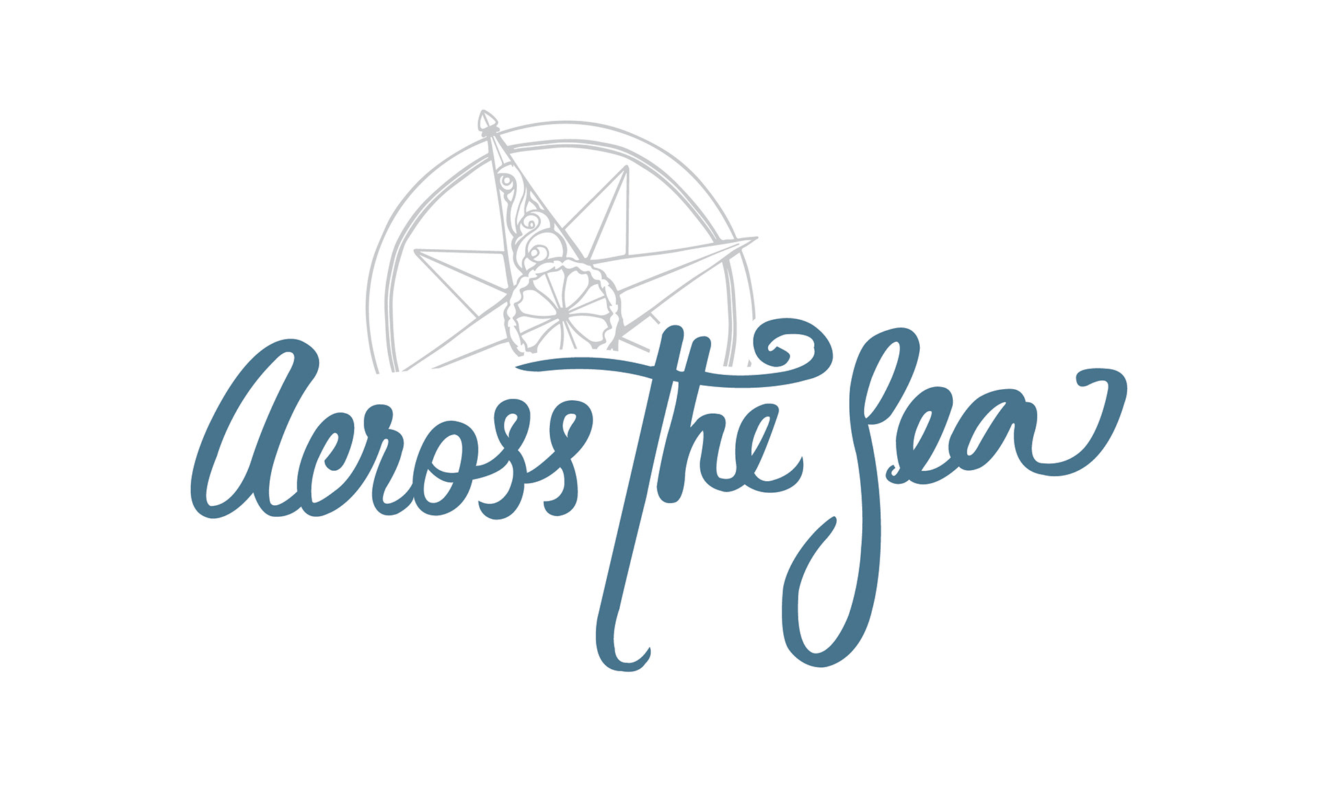
We went through multiple revisions until we managed to improve the idea the client has. We experimented with colors as well and at the end we modified an existing font to make it look as if it was written a long time ago. The requirements of the client, although simple, required a lot of planning and a lot of concepts: hand-drawn font, a vintage compass and the use of purples and blues. Their old logo included a seascape that they wanted to keep. To design some of the early version I drew inspiration from logos of progressive bands form the 70's and 80's.
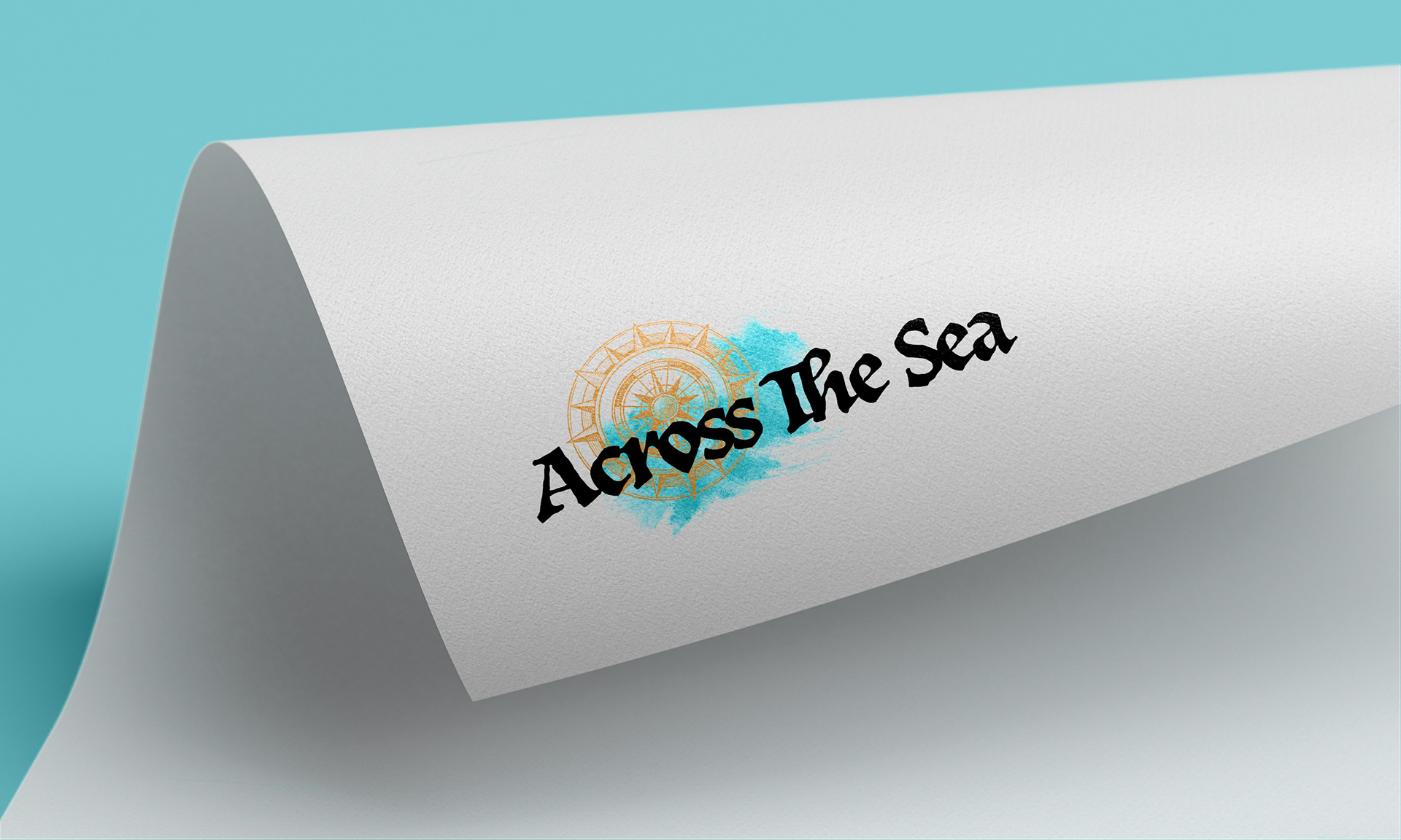
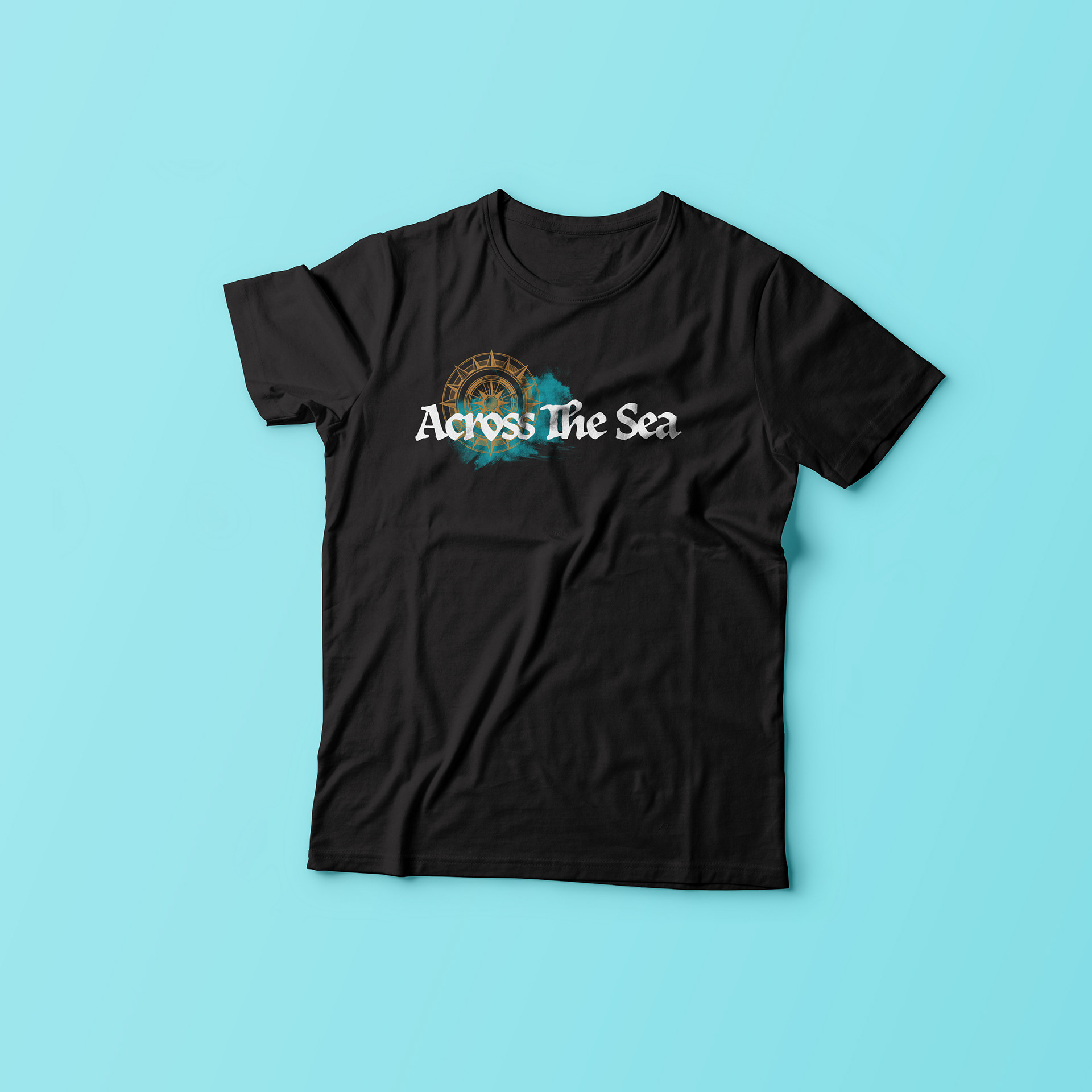
See below all the steps and designs we made to get to the current Across The Sea's logo:

Need a logo design?
Contact me of check my Fiverr Gigs for more affordable options.